Redefining our Information Hierarchy for job postings
How we created a research-backed framework to help teams experiment while upholding a consistent user experience
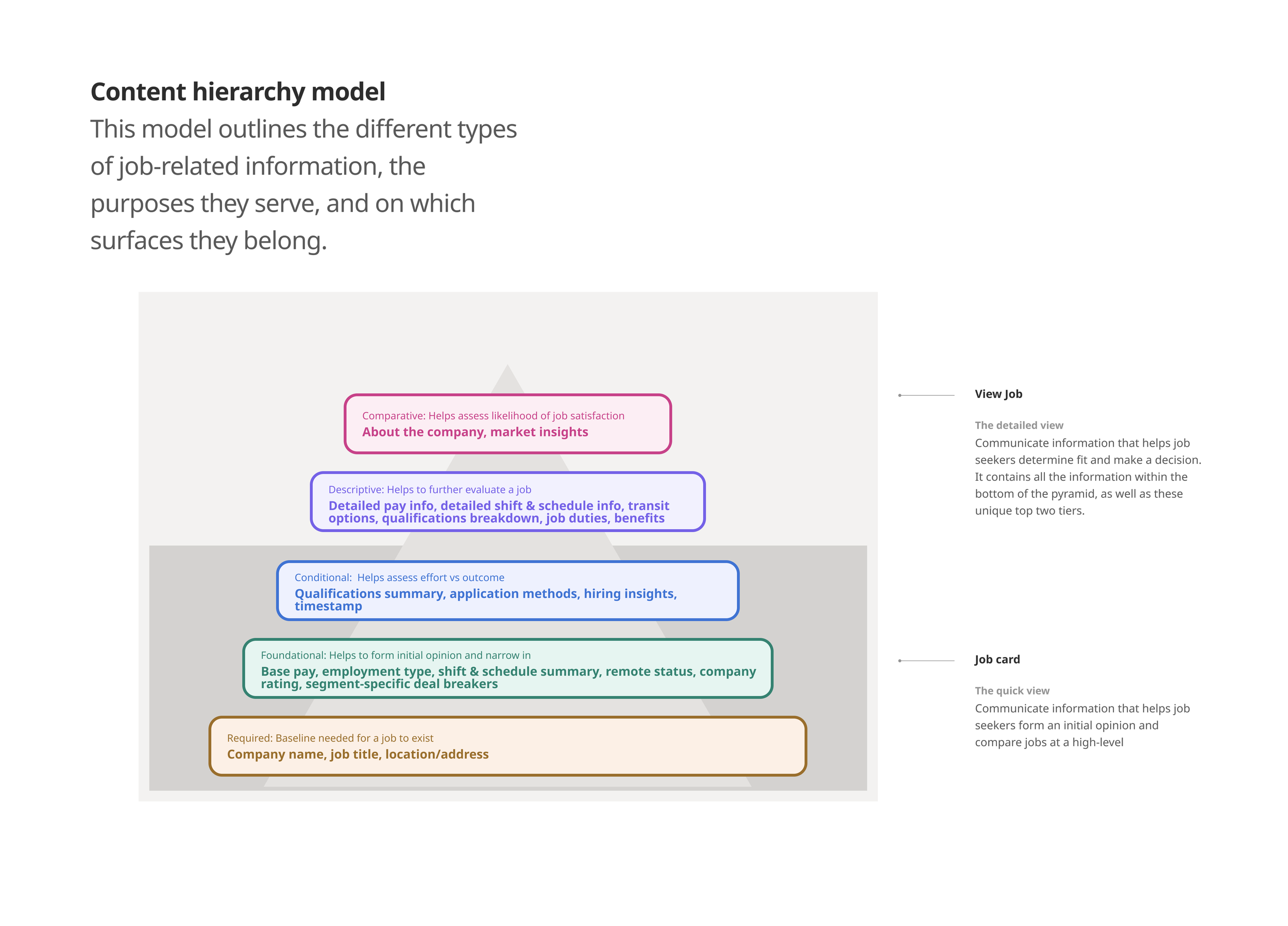
Background: Job descriptions are a pivotal part of the Indeed experience. Job seekers need to compare jobs across discovery surfaces and make informed apply decisions based on compatibility. On Indeed, job descriptions show up in one of two ways: as a preview (job cards), or as a complete description (view job).
Problem: Because of the importance of job cards and view-job pages, many teams across the company ask to run experiments these surfaces. But a lack of guidance and flexibility within our current system was creating an unpredictable experience for job seekers and a confusing experiment approval process for product teams.
Solution: To address this issue, we created guidance around which pieces of information belong on which surfaces. Forming our hypotheses based on prior research and experiments, we created a content model to enable teams to make quick decisions. This model was tested in research and resulted in a set of best practices for design and experimentation on job cards and view-job pages.
My involvement: Identified the need for a new system, got buy-in from UX and Product leaders, created the content model and iterated on it based on feedback, identified need for research to validate our assumptions, kept our resources up-to-date, lead product conversations around experimentation opportunities, provided guidance to other teams to make informed product decisions based on our framework.
creating a dynamic display System for jobs
How we personalized the job-discovery experience to support job seekers and employers
Background: Helping employers attract high-quality candidates is an top priority for Indeed. As part of our sponsored product, our team needed to find ways to help sponsored jobs garner more attention from candidates. While all job descriptions are comprised of foundational information (title, pay, location, employment type), there are enticers that help to support job evaluation and the application process. Our team wanted to optimize this information and show it in the right moments to the right job seekers.
Problem: While we recognized the importance of this type of supplemental information, we lacked a systemic approach for how different types of information should manifest on a job description based on level of sponsorship and quality of fit. This was resulting in information overload on our job cards and a lack of thoughtful IA to help job seekers make informed decisions. It also meant that our sponsored product was not optimized to its full extend. We needed to increase the value of our product offering to acquire more sponsored employers.
Solution: We adopted a systemic lens for different types of information, focusing in particular on what we called “supplemental information”—all that is not critical for a job description, but that entices job seekers to engage with a job. To help us determine which pieces of supplemental should show on job cards in which moments, we created a content model. This model then allowed us to create a series of experiments to test our hypotheses about supplemental information.
My involvement: Identified opportunity to leverage supplemental information as part of our sponsored strategy, categorized and defined existing job information based on current system, created content model based on data-informed hypotheses and Product feedback, lead experimentation strategy and scoping conversations to help validate our hypotheses, created wireframes to help guide design direction.

Increasing engagement with Strong-match jobs
How we designed a full-screen takeover on mobile to help users find their next job
Background: The Indeed feed presents job seekers with a list of job recommendations based on their profile and behaviour. But within this list, some jobs are a stronger match than others. To help bring these strong-match jobs to the surface, we wanted to explore a one-at-a-time experience that would take over the entire screen on mobile devices, similar to content patterns seen social media products.
Problem: Strong-match jobs were getting lost in the user’s feed, resulting is less engagement with jobs that users were more likely to get.
Solution: Driving inspiration from social media products, we created a one-job-at-a-time experience that would take over the entire viewport. Allowing users to spend more time evaluation individual jobs that match their profile, we hypothesized that this feature would help increase the likelihood of job seekers hearing back from employers.
My involvement: Leveraged content hierarchy model (shown above) to guide design decisions, lead UX decisions, provided directional guidance on the information architecture and match signals, advocated to testing several variants to find the ideal content hierarchy, define Research scope in close collaboration with UXR.
